Shadow under Toolbar

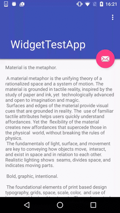
How to implement a simple gradient shadow anchored by a Toolbar which lives in a CoordinatorLayout and could be collapsing as well? Something like that:

toolbar_shadow

First of all here are a shadow drawable itself (named drawable/toolbar_dropshadow.xml):

<?xml version="1.0" encoding="utf-8"?>
<shape xmlns:android="http://schemas.android.com/apk/res/android"
       android:shape="rectangle">
    <gradient
        android:startColor="@android:color/transparent"
        android:endColor="#88333333"
        android:angle="90"/>
</shape>

Second, shadow should be tied to the Toolbar. Like that:

<?xml version="1.0" encoding="utf-8"?>
<android.support.design.widget.CoordinatorLayout
    xmlns:android="http://schemas.android.com/apk/res/android"
    xmlns:app="http://schemas.android.com/apk/res-auto"
    android:layout_width="match_parent"
    android:layout_height="match_parent"
    android:fitsSystemWindows="true">

    <android.support.design.widget.AppBarLayout
        android:layout_width="match_parent"
        android:layout_height="wrap_content"
        android:theme="@style/ThemeOverlay.AppCompat.Dark.ActionBar">

        <android.support.design.widget.CollapsingToolbarLayout
            android:id="@+id/collapsing_toolbar"
            android:layout_width="match_parent"
            android:layout_height="wrap_content"
            app:layout_scrollFlags="scroll|exitUntilCollapsed"
            app:contentScrim="?attr/colorPrimary"
            app:expandedTitleMarginStart="72dp"
            app:expandedTitleMarginEnd="64dp">

             <!-- content -->
</android.support.design.widget.CollapsingToolbarLayout>
    </android.support.design.widget.AppBarLayout>

    <android.support.v4.widget.NestedScrollView
        android:layout_width="match_parent"
        android:layout_height="match_parent"
        android:clipChildren="false"
        android:clipToPadding="false"
        android:layout_gravity="fill_vertical"
        app:layout_behavior="@string/appbar_scrolling_view_behavior">

        <!-- content -->

    </android.support.v4.widget.NestedScrollView>

    <RelativeLayout
        android:layout_width="match_parent"
        android:layout_height="10dp"
        app:layout_anchor="@id/collapsing_toolbar"
        app:layout_anchorGravity="bottom">

        <View
            android:layout_width="match_parent"
            android:layout_height="5dp"
            android:layout_alignParentBottom="true"
            android:background="@drawable/toolbar_dropshadow"/>
    </RelativeLayout>

</android.support.design.widget.CoordinatorLayout>

Note that when using app:layout_anchor attribute in some view the latter is laid out in the way such that view’s center point is just aligned on the line specified by the app:layout_achorGravity attribute. This leads the shadow view (which is just a rectangle of 5dp height and matches the parent by width) to overlap with the toolbar. In order to avoid that one should place the shadow view into container which height is twice of shadow’s height and supply an anchor attribute to that container. Thus the shadow view will get a necessary margin (don’t forget to supply android:layout_alignParentBottom=”true” as well).

Shadow under Toolbar

Style for flat button

Check out the sample of flat button. A key here is to inherit Base.Widget.AppCompat.Button.Borderless style. Define this in styles.xml:

<style name="FlatButton" parent="Base.Widget.AppCompat.Button.Borderless">
    <item name="android:textAppearance">@style/TextStyle</item>
    <item name="android:textAllCaps">true</item>
    <item name="android:textColor">?colorAccent</item>
    <item name="android:textSize">14dp</item>
</style>

<style name="TextStyle" parent="android:TextAppearance.Widget.TextView">
    <item name="android:textStyle">normal</item>
</style>

Use it as style attribute for your custom button:

<Button
    android:id="@+id/btn_send"
    android:layout_width="wrap_content"
    android:layout_height="wrap_content"
    android:text="Send"
    style="@style/FlatButton" />

Or make it default style for every Button view in your Activity. Define custom theme for Activity like this:

<style name="MyActivity" parent=...>
    <item name="buttonStyle">@style/FlatButton</item>
</style>
Style for flat button

Glide CROP Transformations

Here is a well-known way to download an image by its Url and perform custom bitmap transformation on it before ImageView consume the result. Let’s use Glide:

Glide.with(activity)
.load(photoUrl)
.asBitmap()
.listener(listener)
.transform(ImageTransform.create(activity, cropType))
.into(imageView);

The magic goes from our custom ImageTransform class. It extends BitmapTransformation class defined in Glide library and can perform any complex transformation we want.

Let’s declare several kinds of crop transformations and make integer constants to refer to them:

public static final int DEFAULT = 0;
public static final int CIRCLE_CROP = 1;
public static final int TOP_CROP = 2;
public static final int CENTER_CROP = 3;
public static final int BOTTOM_CROP = 4;
@IntDef({DEFAULT, CIRCLE_CROP, TOP_CROP, CENTER_CROP, BOTTOM_CROP})
@Retention(RetentionPolicy.SOURCE)
public @interface CropType {}

I’m going to implement CIRCLE_CROP, TOP_CROP, CENTER_CROP and BOTTOM_CROP transformations manually. Then one can use any of these constants as a second (cropType) parameter when constructing an instance of transformation operation:

public static BitmapTransformation create(
        Context context,
        @CropType int cropType) {
    switch (cropType) {
        case CIRCLE_CROP:
            return new CircleTransform(context);
        default:
            return new CropTransform(cropType, context);
    }
}

Let’s consider how could we actually implement such transformations.

CIRCLE_CROP:
public static class CircleTransform extends BitmapTransformation {
    public CircleTransform(Context context) {
        super(context);
    }

    @Override
    protected Bitmap transform(BitmapPool pool, Bitmap toTransform, int outWidth, int outHeight) {
        return circleCrop(pool, toTransform);
    }

    private static Bitmap circleCrop(BitmapPool pool, Bitmap source) {
        if (source == null) return null;
        int size = Math.min(source.getWidth(), source.getHeight());
        int x = (source.getWidth() - size) / 2;
        int y = (source.getHeight() - size) / 2;

        Bitmap squared = pool.get(size, size, Bitmap.Config.ARGB_8888);
        if (squared == null) {
            squared = Bitmap.createBitmap(source, x, y, size, size);
        }
        Bitmap result = pool.get(size, size, Bitmap.Config.ARGB_8888);
        if (result == null) {
            result = Bitmap.createBitmap(size, size, Bitmap.Config.ARGB_8888);
        }

        Canvas canvas = new Canvas(result);
        Paint paint = new Paint();
        paint.setShader(new BitmapShader(squared, BitmapShader.TileMode.CLAMP, BitmapShader.TileMode.CLAMP));
        paint.setAntiAlias(true);
        float r = size / 2f;
        canvas.drawCircle(r, r, r, paint);
        return result;
    }

    @Override
    public String getId() {
        return "com.orcchg.ImageTransform: CircleTransform";
    }
}

Implementation is based on this StackOverflow thread.

TOP_CROP, CENTER_CROP, BOTTOM_CROP:
public static class CropTransform extends BitmapTransformation {
    private final @CropType int mCropType;

    public CropTransform(@CropType int cropType, Context context) {
        super(context);
        mCropType = cropType;
    }

    @Override
    protected Bitmap transform(BitmapPool pool, Bitmap toTransform, int outWidth, int outHeight) {
        final Bitmap toReuse = pool.get(outWidth, outHeight, toTransform.getConfig() != null ? toTransform.getConfig() : Bitmap.Config.ARGB_8888);
        Bitmap transformed = crop(toReuse, toTransform, outWidth, outHeight);
        if (toReuse != null && toReuse != transformed && !pool.put(toReuse)) {
            toReuse.recycle();
        }
        return transformed;
    }

    private Bitmap crop(Bitmap recycled, Bitmap toTransform, int outWidth, int outHeight) {
        if (toTransform == null) {
            return null;
        } else if (toTransform.getWidth() == outWidth && toTransform.getHeight() == outHeight) {
            return toTransform;
        }

        final float scale;
        float dx = 0, dy = 0, offsetFactor = 0.0f;
        Matrix m = new Matrix();
        if (toTransform.getWidth() * outHeight > outWidth * toTransform.getHeight()) {
            scale = (float) outHeight / (float) toTransform.getHeight();
            dx = (outWidth - toTransform.getWidth() * scale) * 0.5f;
        } else {
            scale = (float) outWidth / (float) toTransform.getWidth();
            switch (mCropType) {
                case TOP_CROP:
                    dy = 0;
                    break;
                default:
                case CENTER_CROP:
                    dy = (outHeight - toTransform.getHeight() * scale) * 0.5f;
                    offsetFactor = 0.5f;
                    break;
                case BOTTOM_CROP:
                    dy = (outHeight - toTransform.getHeight() * scale);
                    break;
            }
        }

        m.setScale(scale, scale);
        m.postTranslate((int) (dx + 0.5f), (int) (dy + offsetFactor));
        final Bitmap result;
        if (recycled != null) {
            result = recycled;
        } else {
            result = Bitmap.createBitmap(outWidth, outHeight, getSafeConfig(toTransform));
        }

        // We don't add or remove alpha, so keep the alpha setting of the Bitmap we were given.
        TransformationUtils.setAlpha(toTransform, result);

        Canvas canvas = new Canvas(result);
        Paint paint = new Paint(PAINT_FLAGS);
        canvas.drawBitmap(toTransform, m, paint);
        return result;
    }

    @Override public String getId() {
        return "com.orcchg.ImageTransform: CropTransform_" + mCropType;
    }
}

And a helper method:

private static Bitmap.Config getSafeConfig(Bitmap bitmap) {
    return bitmap.getConfig() != null ? bitmap.getConfig() : Bitmap.Config.ARGB_8888;
}

And of course, it is all just a simple modification of original Glide’s CENTER_CROP transformation source code.

Glide CROP Transformations

Callback when Snackbar appears

A well-known case when Snackbar pushes up FAB in a CoordinatorLayout. This also works well with custom FABs thanks to Behaviors. But is might be useful to have a callback at the moment Snackbar first became visible or went gone. For these reasons we need an interface:

public interface OnSnackbarAppearCallback {
    /**
     * Snackbar has just started to roll out from down to top.
     */
    void onAppear(Snackbar snackbar);
    /**
     * Snackbar has just completely gone.
     */
    void onDisappear(Snackbar snackbar);
}

Now we make a helper method to actually show Snackbar when needed:

public static void showSnackbar(
        Activity activity,
        String message,
        final OnSnackbarAppearCallback listener) {
    final Snackbar snackbar = // create snackbar as you prefer
    final int duration = 3000; // corresponds to Snackbar.LENGTH_LONG
    snackbar.getView().post(new Runnable() {
        @Override
        public void run() {
            if (listener != null) {
                listener.onAppear(snackbar);
            }
        }
    });
    snackbar.getView().postDelayed(new Runnable() {
        @Override
        public void run() {
            if (listener != null) {
                listener.onDisappear(snackbar);
            }
        }
    }, duration);
    snackbar.show();
}
Callback when Snackbar appears

Get Toolbar navigation View

In order to get and force Toolbar navigation icon to have a specific color, do the following:

protected void setArrowColorOnToolbar(@ColorRes int colorId) {
    for (int i = 0; i < mToolbar.getChildCount(); ++i) {
        View view = mToolbar.getChildAt(i);
        if (view != null && view instanceof ImageButton) {
            ImageButton imageButton = (ImageButton) view;
            imageButton.getDrawable().setColorFilter(
                getResources().getColor(colorId), PorterDuff.Mode.SRC_IN);
        }
    }
}
One can also manipulate with navigation icon through XML:
<style name="MyActivityTheme">
    <item name="navigationIcon">@drawable/ic_close_white</item>
</style>
Get Toolbar navigation View

ViewPager: access pages and tracking visibility

Access pages:

In order to access a specific page in ViewPager, one should keep track pages in PagerAdapter instance. This is done simply by extending FragmentStatePagerAdapter, like here:

public abstract class TrackPagerAdapter extends FragmentStatePagerAdapter {
    private SparseArray<Fragment> mPages;

    public TrackPagerAdapter(FragmentManager fm) {
        super(fm);
        mPages = new SparseArray<>();
    }

    @Override
    public Object instantiateItem(ViewGroup container, int position) {
        Fragment fragment = (Fragment) super.instantiateItem(
                container, position);
        mPages.put(fragment);
        return fragment;
    }

    @Override
    public void destroyItem(
        ViewGroup container, int position, Object page) {
        mPages.remove(page);
        super.destroyItem(container, position, page);
    }

    public Fragment accessPage(int position) {
        return mPages.get(position);
    }
}

Note: never use getItem(int position) method to access a specific page, because it is only for internal use and serves to create pages, not to get existing ones.

Track page visibility:

It is not clear how to keep track page’s visiblity: when it has gone and when it has become visible. Of course, one can find suggestions to use setUserVisibilityHint() method of Fragment class, but this method could be called multiple times (even before onCreateView()), and may not working properly without several additional “strange” flags, such as isVisible() and so on.

There is a much better solution. Let’s make an interface which public methods are called when page’s visibility changes:

public interface OnPageVisChanged {
    /**
     * Called when page becomes fully visible.
     */
    void onPageActive(int position);
    /**
     * Called when page is completely gone.
     */
    void onPageInactive(int position);
}

Now we should make our pages in PagerAdapter implement this interface. Any page (Fragment) in PagerAdapter is able to track it’s own visibility. For example, one can show soft keyboard, when page becomes fully visible and hide it when the page has gone.

public class PageFragment extends Fragment implements OnPageVisChanged {
    @Override
    public void onPageActive(int position) {
        // override in super class
    }
    @Override
    public void onPageInactive(int position) {
        // override in super class
    }
}

And we also must use PageFragment instead of just Fragment in out TrackPagerAdapter. We don’t copy & paste the code above, but it should be slightly modified this way.

Finally, we should actually call these methods:

int mTargetPage = 0;  // currently visible page position

mViewPager.addOnPageChangeListener(
    new ViewPager.SimpleOnPageChangeListener() {
    @Override
    public void onPageSelected(int position) {
        // class cast is omitted to keep sample short
        OnPageVisChanged newPage = mPagerAdapter.accessPage(position);
        OnPageVisChanged oldPage = mPagerAdapter.accessPage(mTargetPage);
        if (newPage != null) { newPage.onPageActive(position); }
        if (oldPage != null) { oldPage.onPageInactive(mTargetPage); }
        mTargetPage = position;
    }
});
ViewPager: access pages and tracking visibility

How to tint a drawable

Suppose we have a custom drawable – an image inside a circle. Both image and circle has color (but image icon has white color initially). We can do the following:

<xml version="1.0" encoding="utf-8">
<layer-list xmlns:android="http://schemas.android.com/apk/res/android">
    <item 
        android:top="0dp" 
        android:left="0dp" 
        android:bottom="0dp" 
        android:right="0dp>
        <shape android:shape="oval">
            <size android:width="9dp" android:height="9dp"/>
            <stroke android:width="2dp" 
                    android:color="@color/color_orange"/>
            <solid android:color="@android:color/transparent"/>
        </shape>
    </item>

    <item>
       <bitmap
           android:gravity="center"
           android:tint="@color/color_orange"
           android:src="@drawable/ic_create_white_32dp"/>
    </item>
</layer-list>

android:tint attribute will only work on Lollipop and later API versions. How could we support older devices? There are two easy ways, one can choose any of them:

1. Use android.support.v4.graphics.drawable.DrawableCompat:


@ColorInt int color = getResources().getColor(R.color.color_orange);
Drawable drawable = getResources().getDrawable(R.drawable.circle_drawable);
Drawable wrapped = DrawableCompat(drawable);
DrawableCompat.setTint(wrapped, color);

2. Tint ImageView manually:

ImageView should have a drawable described above in xml as its android:background attribute. On Pre-Lollipop devices only circle stroke will have a specific color (here @color/color_orange), but the image icon will be white because android:tint is ignored. It could be then tinted manually in Java:


ImageView image = ...

image.setColorFilter(color, PorterDuff.Mode.SRC_ATOP);


How to tint a drawable

Adjust sizes of Activity’s window

An android.view.Window class underlies an Activity view content. Sometimes you need to strictly define its sizes say on Tablet devices, but for some reason it becomes quite difficult. Given a complex layout it could be difficult to define which view is actually responsible for resulting sizes of the window.

There is a way to strictly define the width and the height of a window programmatically:

public static void adjustWindowSizes(
    Activity activity,
    @DimenRes int widthDimensionResId,
    @DimenRes int heightDimensionResId) {
    WindowManager.LayoutParams params =
        activity.getWindow().getAttributes();
    Resources res = activity.getResources();
    params.width = (int) res.getDimension(widthDimensionResId);
    params.height = (int) res.getDimension(heightDimensionResId);
    activity.getWindow().setAttributes(params);
 }
Adjust sizes of Activity’s window